
BentoBox design system
BentoBox design system — designing for hospitality. I led the design in creating a design system to support BentoBox’s mission to developing new products and features for the hospitality industry.
My Role
Product Designer
Team
Director of Product
Product Manager
Chief Technology Officer
Director of Engineering
Senior Software Engineers
Software Engineers
Project Duration
3 months
Background
A quick glance at the BentoBox CMS, one can see that there were inconsistencies. We found buttons with varying colors to multiple heading sizes. Each time we wanted to create a new page, it was practically built from scratch. This frustrated the team and we knew that a design system was important to ensure product scalability and fast design iterations.
This was a chance to revisit the design, experience, and future-proof the code structure. For the designers, we saw was room for improvement in terms of updating the visual appeal while elevating the mobile experience. For the engineers, this change was heavily needed. As it stands, the frontend was using a framework called Backbone, an old Javascript framework that was not scalable. The engineering team was already gradually migrating to React beforehand so this was a great opportunity to define a design system. This would save the company a lot of time in the future as they would not have to build custom components.
These changes would be pleasing to the eye, run smoother, and run faster—laying a solid foundation for a more robust BentoBox. It gives the company the opportunity to focus on other matters such as data flows, business logic, and so on.

BentoBox old user interface
Visual Audit
The first step was to conduct a visual audit. In these meetings, we included the stakeholders whose buy-in was essential in the creation and adoption of the design system. By having these exercises, we were able to:
Involve everyone from the start -
Makes for easier adoption of the design system later on.Develop a shared language -
Understanding how the team categories and identified components.Understanding design decisions -
Do we remove this component? merge it? discuss cases.
This exercise helped us uncovered the extent of inconsistencies and variations we have in our hands. It allowed everyone in the team to gauge how much of an undertaking this process would take.
Who are we designing for?
The team saw this as a great opportunity to re-establish our understanding of who we’re designing for and how one perceives the BentoBox brand. The BentoBox CMS has two main user audiences, internal and external users:
Internal users -
BentoBox employees who use the CMS daily. This ranges from the onboarding team that sets up content pages to website designers designing the BentoBox customer’s websites.
External users -
Restaurant owners and staff. They are limited to designated pages in the CMS that allows restaurants to manage their restaurant. This ranges from updating their food images to 86ing a menu item.
By interviewing these two groups and the findings from the visual audit, we were able to recognize opportunities to improve aspects of our platform.
Layouts and Ratios
In order to utilize both the design and engineer’s time to the fullest, we started by looking through the types of pages in the CMS. We found pages that used similar layouts, were not the same or had their own. The page types were:
Navigation
Form with settings
List
Form without settings
Media gallery
Landing featured page
Table
Detail Instance
Wizard
Modal
Tabs
Based on the types of pages, I designed the wireframes of the layouts while showcasing the ratios of the existing components and how they would live in their layouts. This allowed the engineering team to immediately start building the new code of the layouts.

Mobile layouts with ratios

Desktop layouts with ratios
Components and Patterns
We interpreted and refined the visual language that was already created. It was important for us to make these changes while keeping basic functions the same. Throughout this process, the product team conducted a UI inventory — buttons, cards, lists, forms, images, and so on. We documented the components and categorized them into the role they would play in the design system.
There were moments when members of the team saw opportunities for a component to be changed or removed. This would require the team to meet and lay the flows side by side where the component is being used. Any changes made to this component would need to be universally agreed upon by everyone in the room. The next step is to meet with the stakeholders to get their buy-in on the changes.

Components and patterns
Usage guidelines
The team worked closely to define the usage guidelines of each component.
For the design and onboarding team, I documented the design system onto Frontify, a brand management platform our designers already use for their own design practices.
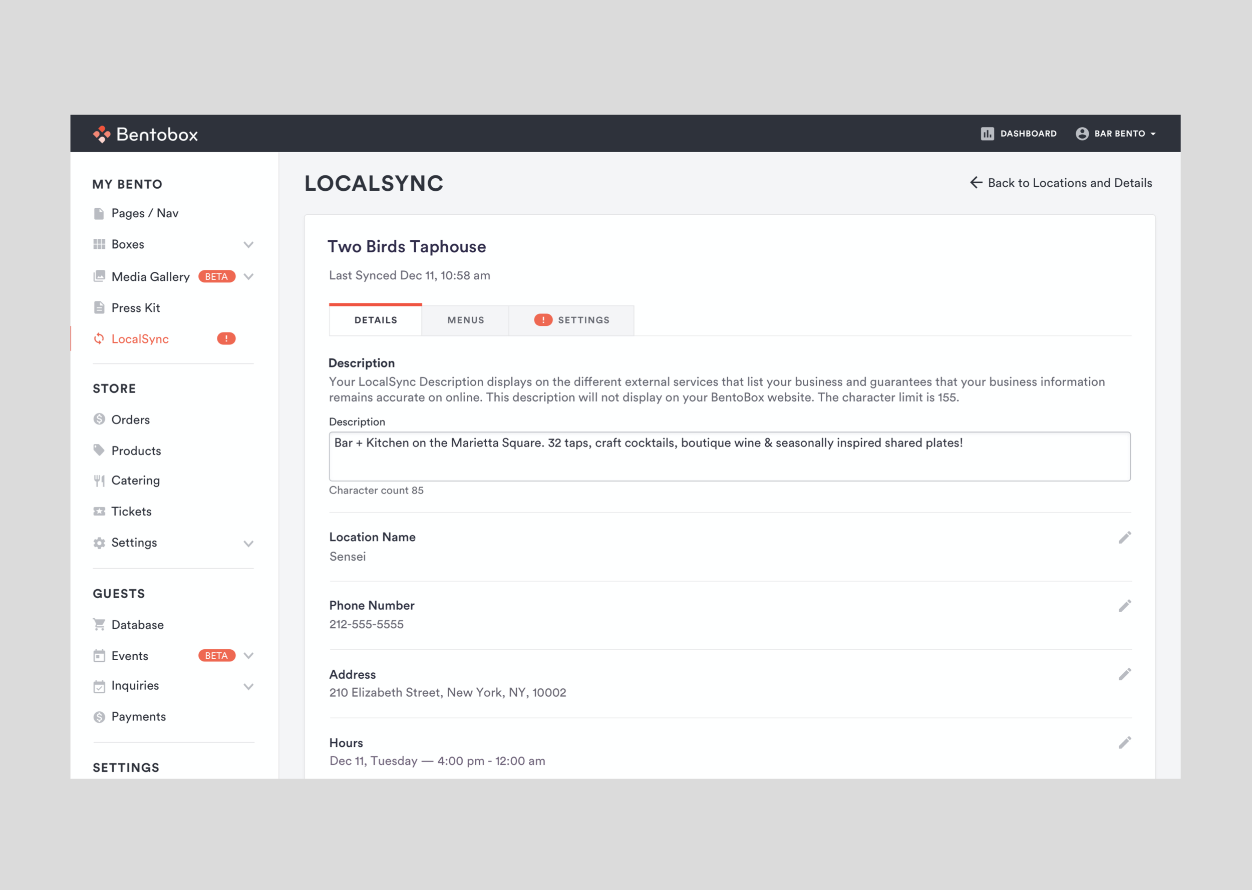
As for the engineers, I worked closely with the engineering team and our summer intern to document the components onto GitHub.

Frontify - Columns, gutters, and margins

Frontify - Overview of Typography

Frontify - Placement
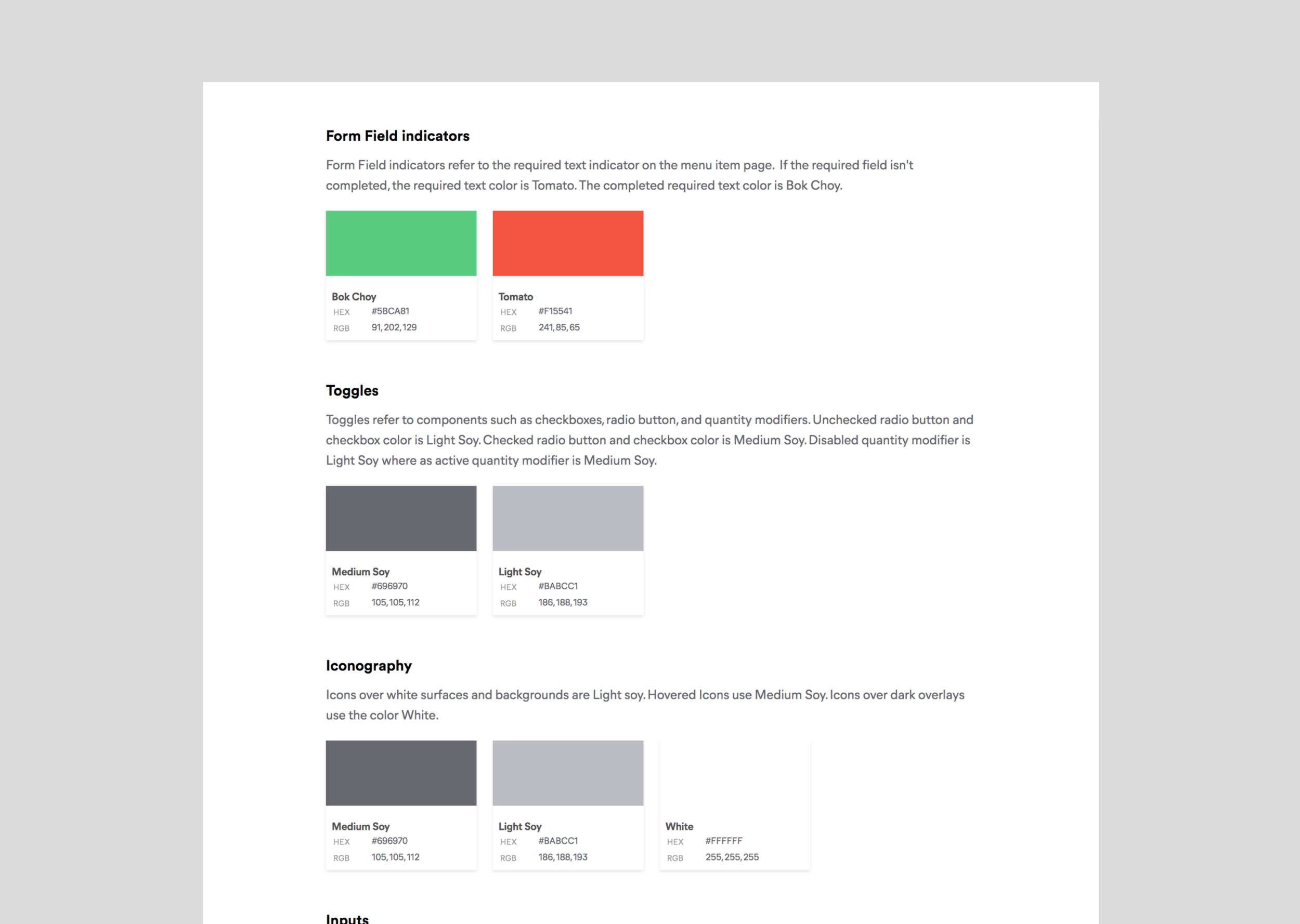
Frontify - Form Field Indicators

Github - Alerts

Github - Icons/Images

Github - Buttons

Github - Lists
Final Designs
The newly updated design system was given a new look, from a dark outdated design to a light, white, and colors aligned with the BentoBox branding.

Dashboard

Table

Detail Instance

Forms

Media Gallery

Wizard

Navigation

Modal

Featured

List
Tabs

Form with Settings
Outcome
The BentoBox design system is now one that is manageable, scalable, and robust. The CMS is consistent from typography, grid, iconography, and so on. Now, when the design team creates new pages, they can easily locate components and have the building blocks they need. Our engineers don’t need to build every component from the bottom up.
This is not the end. The team has learned a lot in the process and we will continue to communicate with our users to gain valuable feedback to continue to iterate the design system.